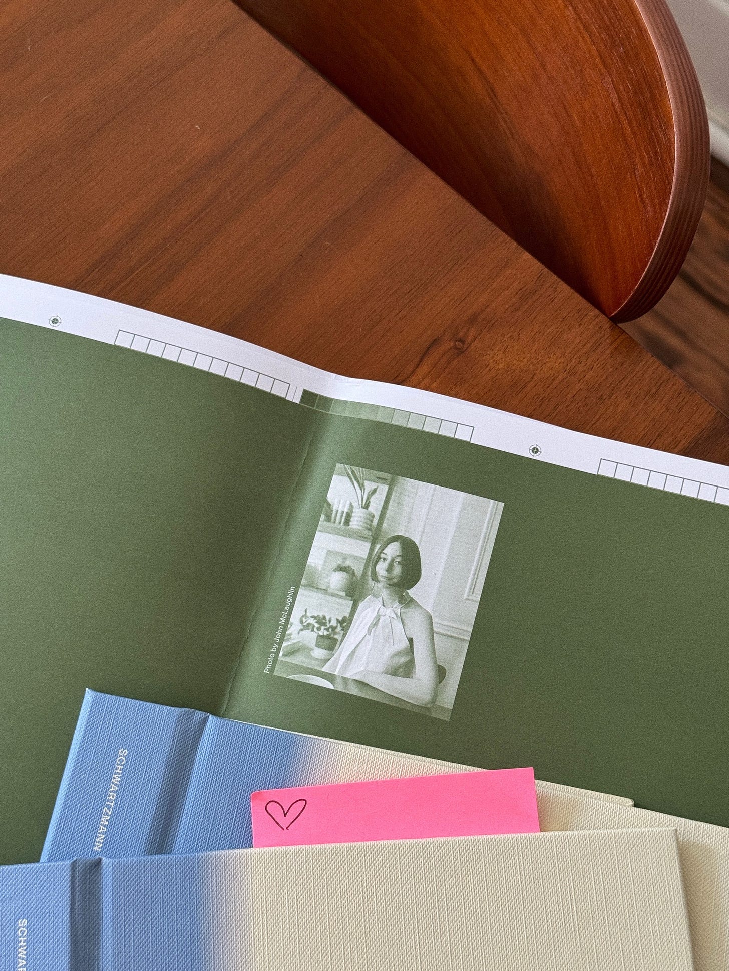
You will notice that the words are black ink on white paper—but they aren’t black and white. They are slow stories acknowledging life’s gray areas and negative spaces, elevated with the colors of sun and sky. Throughout, a ribbon of familiar green—soft and sometimes prickly like grass—keeps you firmly grounded in the moment, marking where you are or where you’ll come back to later. This palette helps paint a picture for my words if the words to describe what you’re reading escape you. It will change throughout our time together. It will quietly show you another way of being. You will hold my book in your hands, and then, page by page, you will see the whole story more clearly. You will find yourself slowing.
···
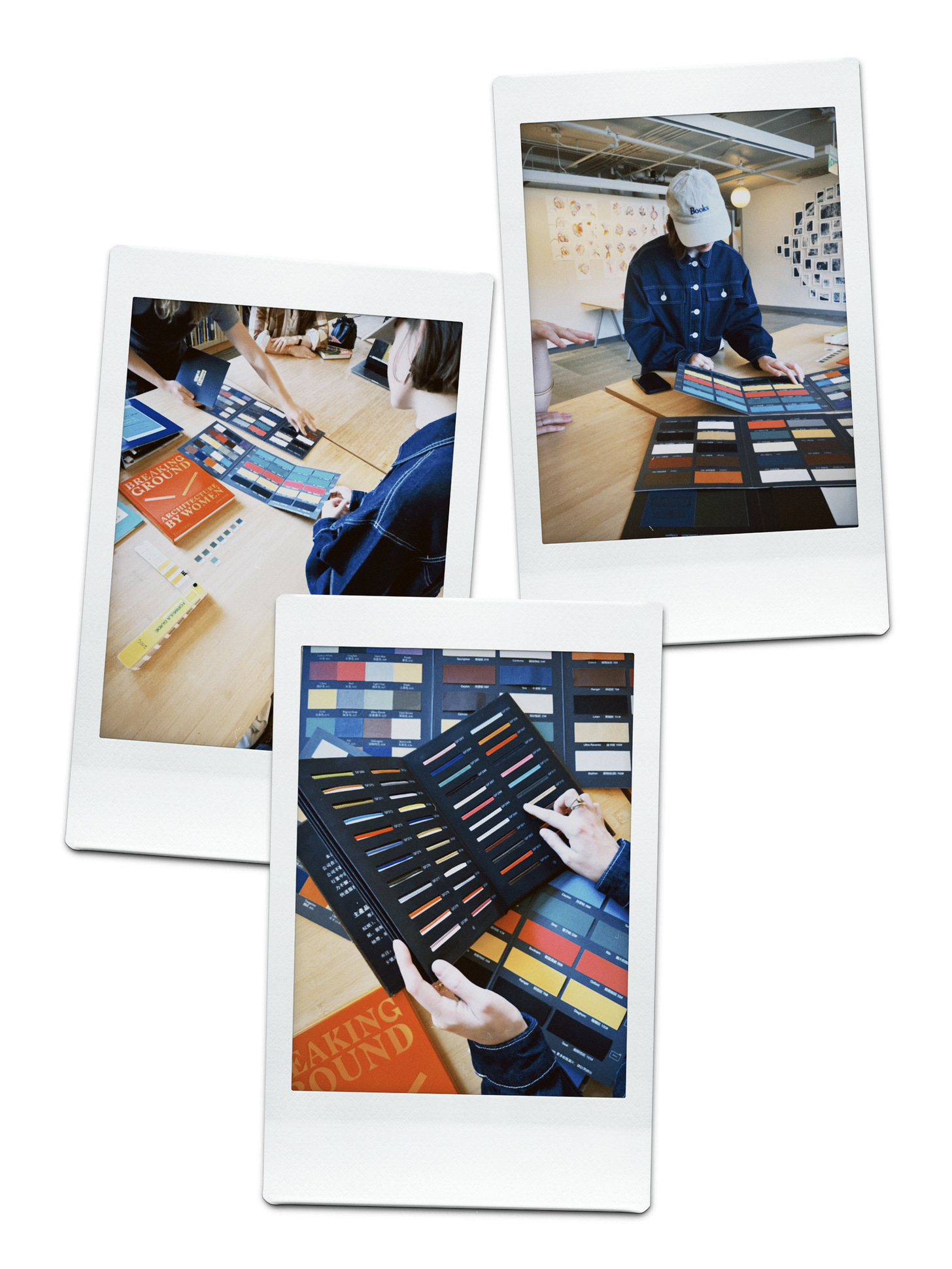
The process of arriving at Slowing’s final (aesthetic) form was slow—and sometimes not so steady—but we got there! And, if I’m being completely honest, my early reliance on visual embellishments came at a point when I was still trying to confidently claim my identity as a writer. I let the design “concept” serve as a scaffolding when all I really had to do was put the words down. By the time I finished writing Slowing, I arrived at that point (read: I could do this. I did it!), meaning everything had changed—including the proposed visual treatment. I had become more discerning in my tastes, but more importantly, a different, quieter tone emerged in the actual stories. I knew the visual aspects of Slowing needed to reflect this evolution. Thus began a meticulous process of developing a design system that upheld the book’s integrity while also giving it “object quality.”
With the latter in mind, Slowing sits at an interesting intersection. It will fit perfectly on your coffee table, but it’s meant to be read. Don’t let the lovely ribbon bookmark detract you from underlining sentences or dog-earing pages. Take care of it, and take it with you on the go. Keep it close. Keep it forever.
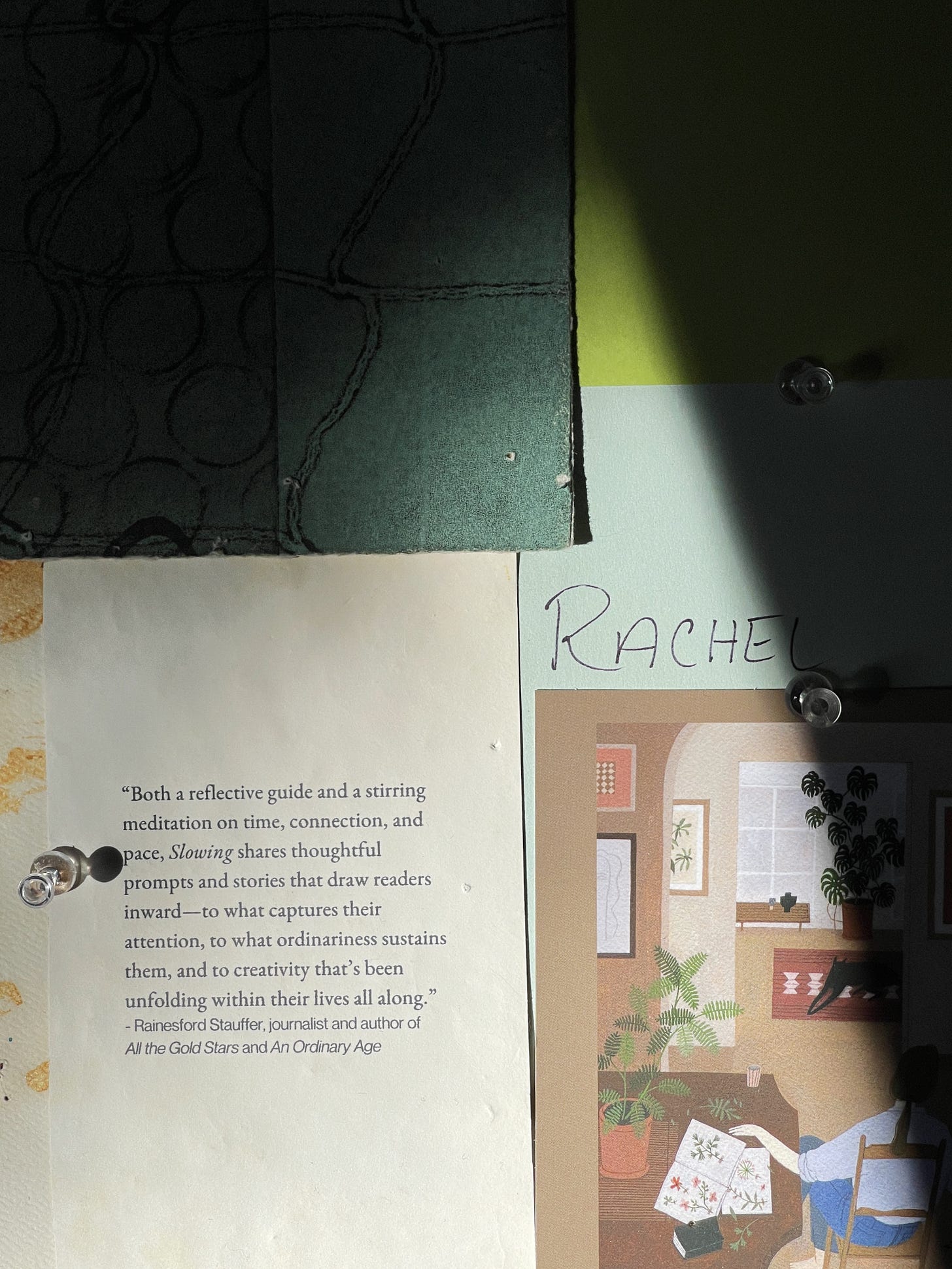
The book’s design was meant to serve these goals. We began with the interiors, which would ultimately set the tone for the cover. For the purposes of this design diary, I keep coming back to color. I wondered what palette would make the most sense to convey Slowing’s pillars—time, pace, and creativity—without leaning too heavily into certain wellness trends. I also wanted to make sure it felt true to who I am.
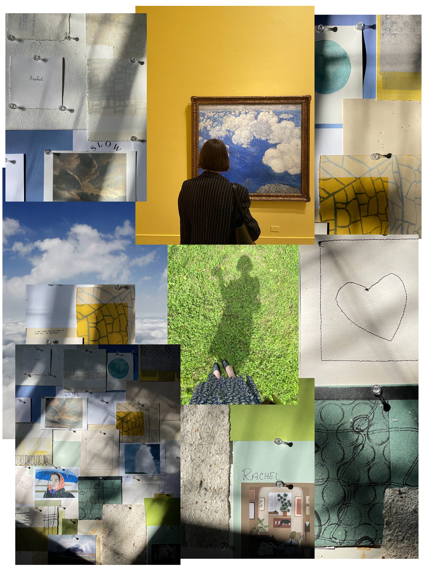
I thought about the colors that often make up my day: a bright morning sun, golden yellow—sometimes blinding or quietly emerging from a wall of clouds. An afternoon walk in Prospect Park, where greenery abounds in the spring and summer. Then, that blue sky—expansive and universal, up until it gives way to the blue hours of the evening, a bruised palette representative of a hard day or a hard day’s work.
Sun, grass, sky—were these too cliché? Too simplistic? Too happy?
As I wrote this book during some of the sunniest—and hardest—days of my life, this tension reinforced something true: all of these elements touch us in some ways, whether we’re lucky enough to have them in our backyards or daydream about them while we’re at our desks. They form a backdrop to our lives, functioning independently of us but integral to our humanity just the same. They are the colors of Slowing, inside and out.


Can’t wait for Slowing! 🖤
I'm so excited to read this <3 And I love seeing a deeper look into the process of it's creation! It inspires me for the future books I have yet to write! Cheers to you, Rachel!